I forgot yesterday was Sunday and so she’s a day late! Honestly, it’s been two weeks since my appendectomy now and time really is a construct because I am losing my mind and wtf do you mean August is over next week???? I would like a redo.
Anyway, let’s get into it.
Fashion Awards nominees have been announced and these categories are kind of stacked!
Here are my choices although I’m sweating having to pick just one for some of these:
Designer Of The Year- Jonathan Anderson for JW Anderson & Loewe
British Menswear Designer Of The Year- Grace Wales Bonner for Wales Bonner
British Womenswear Designer Of The Year- Maximilian Davis for Ferragamo
British Accessories Brand- Stephen Jones for Stephen Jones
New Establishment Menswear- Aaron Esh for Aaron Esh
New Establishment Womenswear- Dilara Findikoglu for Dilara Findikoglu
Model Of The Year- Alex Consani
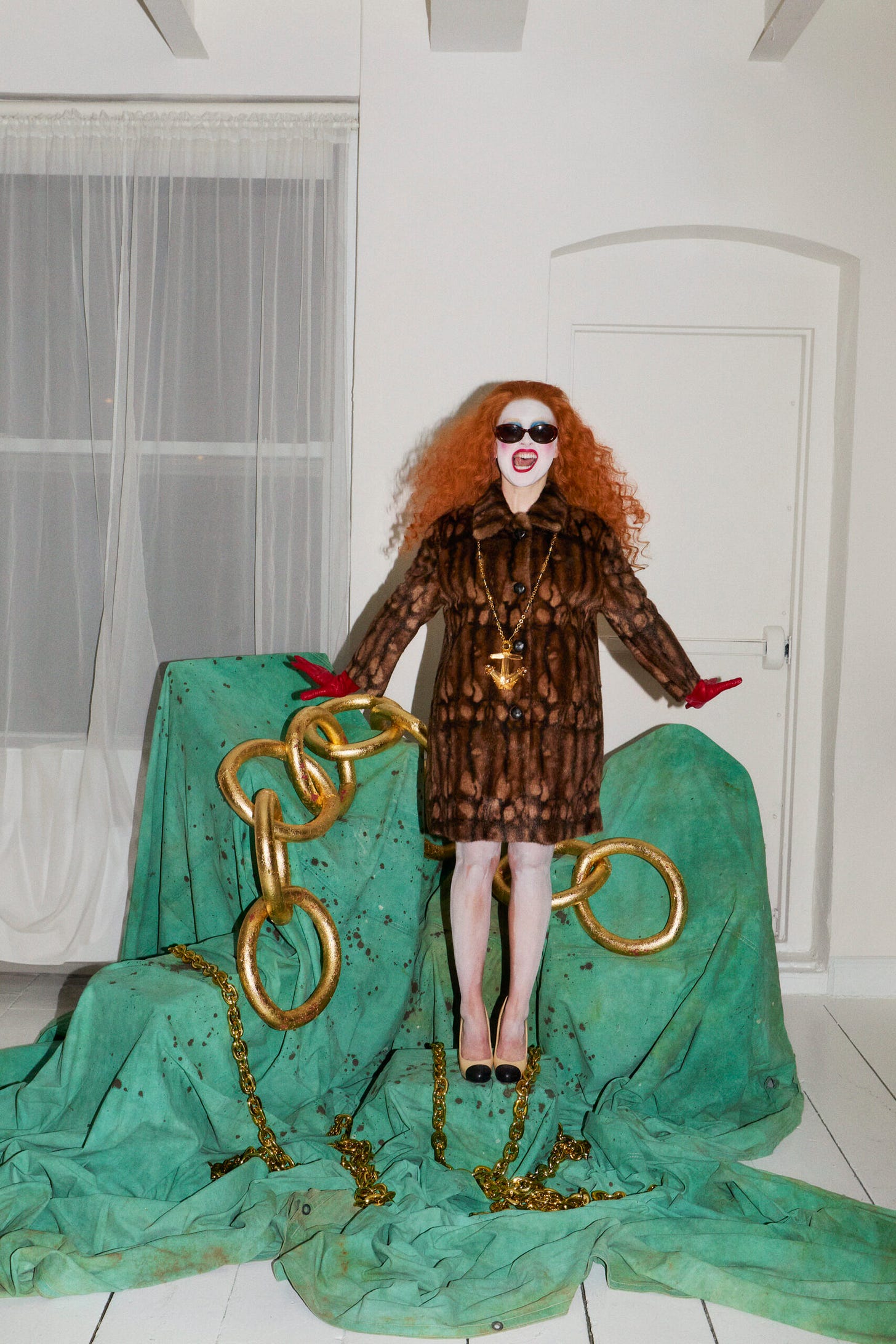
- Chappell Roan for Interview; Dara said that for this editorial they were looking to different archetypes with Chappell’s styling here, and I see that, I feel that, and I love that. This is so incredibly fun, and I like that Chappell is a “character” let’s say, and here she is playing a variety of different characters. Meta. Styled by Dara Allen.
- Tilda Swinton and Julianne Moore for Vogue Spain; Y’all know how much I love Tilda. Her and Julianne look incredible in this editorial, and Tilda is one of the only people that can convince me on Chanel. Harry is one of my favorite stylists, so maybe I’m bias but he ate this up. They’re promoting a movie in which they play two friends that reconnect over some years, but this is very much giving: they were “roommates.” Styled by Harry Lambert.

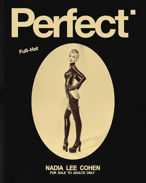
- Nadai Lee Cohen for Perfect; So… I have thoughts. Here Nadia is pulling direct inspiration from Allen Jones’ fetish and BDSM-themed art from the 1960s, and it has sparked a lot of conversation.
This isn’t the first time we’ve seen her directly copy editorials, art, etc. from this era, as it is source material she often turns to, however it’s interesting to see the reaction.
I don’t think a reference immediately discredits someone’s work, because everything has been done before and you did not fall out of a coconut tree, but, using this specific editorial as example, it doesn’t always translate.
Allen Jones’ work came at a time when there was sexual liberation and countercultural movements happening that were incredibly significant, which made it very provocative and subversive, whereas Cohen’s take falls flat. It has no reference to the current BDSM community, and doesn’t really directly respond to today’s society. Yes, it does come at an interesting time when women’s bodies are being policed and there is a rise in conservatism, but the direct copy and paste does not account for the evolution of feminist discourse and the shifting cultural context. Perhaps she could have brought attention to the objectification and fetishization across different marginalized groups or switched gender roles and power dynamics, I don’t know, something.
And this is often my issue with her work— even though sometimes I do think it’s interesting, most of the time it feels too sterile in my opinion. The originals took risks, whereas there isn’t really any risk being taken here. It’s all very superficial, and doesn’t really challenge the viewer in any way. There’s that disconnect between the signifier and the signified.
Then when we look at the public reaction, I think there’s this social currency and capital that exists on the internet today when you can immediately identify a reference or the collection an archival pull is from, but the knowledge often stops there. It’s a lot of, look at me, I’m so smart because I know this thing, but what does that actually mean— nothing. We’re so used to having everything at out fingertips, and so when you’re informed that someone like Nadia is referencing someone else, I’ve almost always noticed an immediate switch up from thinking it’s incredible work to thinking it’s incredibly bad, and I don’t think this is as simple as saying something is good or bad, if it even has anything to do with that at all. The difference between figuring out this information from a tweet, without having to do any work yourself, and Cohen’s actual work, is that she actually took the time to do the research and find the source material and figure out her “signature aesthetic,” if you will. Which is not a defense, really, it’s just a fact, and Cohen isn’t the first to recreate an iconic photoshoot, like, Richard Avedon was doing that shit too. Also! When’s the last time you didn’t copy and paste a full outfit from your Pinterest board?
- Nara Aziza Smith for Harper’s Bazaar; I think this editorial is very cute and I enjoy the styling, but the stuck in a box, doll house, childlike creative direction is for sure a choice when it comes to the Nara Smith of it all! Styled by Caroline Newell.
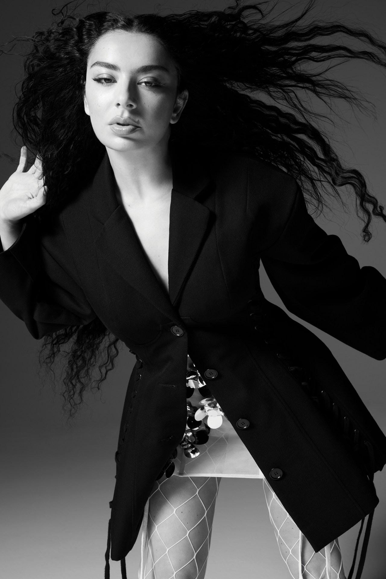
- Charli XCX for Vogue Australia; Oh? Listen, stunning beauty shots, but so boring! This is not a September issue. Also! What a missed opportunity for British Vogue to make her their September cover star instead of Kylie Jenner, tbh. I feel like Brat Summer was such a huge marketing project and this is how you want to wrap it up?The green font is not enough. This very minimalist approach seems to be what Vogue Australia does time after time, and so perhaps that’s tapping into this “care-free Australian” lifestyle, but. Styled by Katelyn Gray.
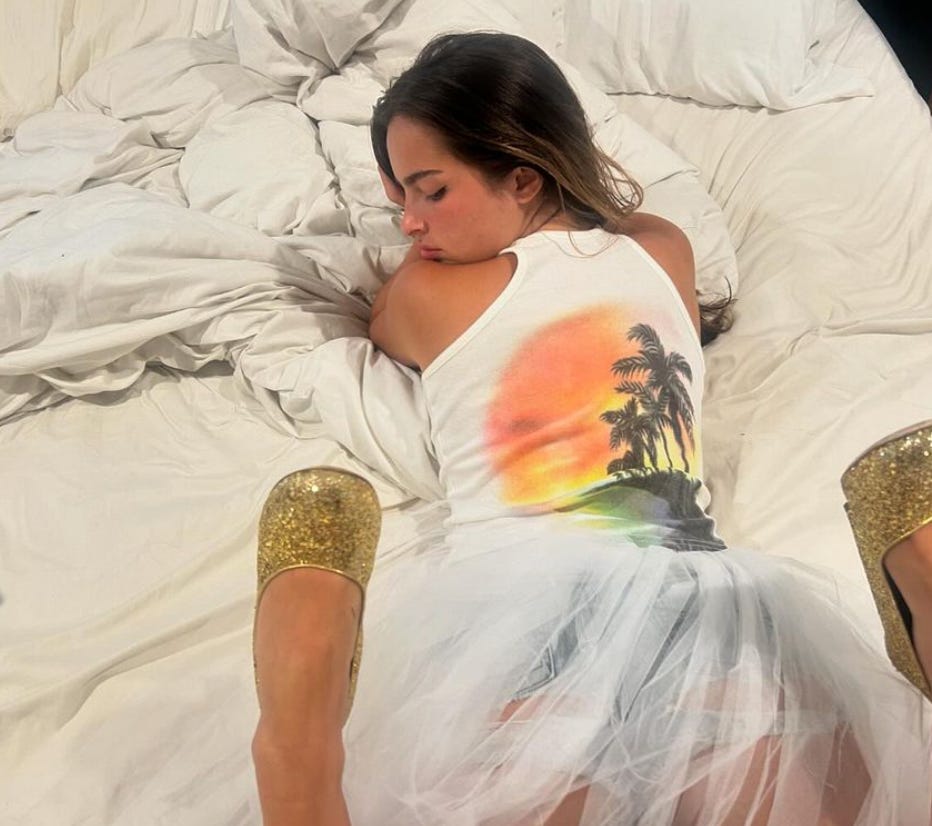
- Addison is wearing Chloé SS1999 on slide three of this carousel. That’s all.
- Jenna payed homage to Lydia Deetz this week with the help of Thom Browne. I do think this is lovely, and you can clock the reference immediately while also noticing those signature Thom Browne-isms. At the same time, there’s something about this copy and paste recreation of looks that we’ve been seeing from styling celebrities recently that is so dull and lifeless to me.
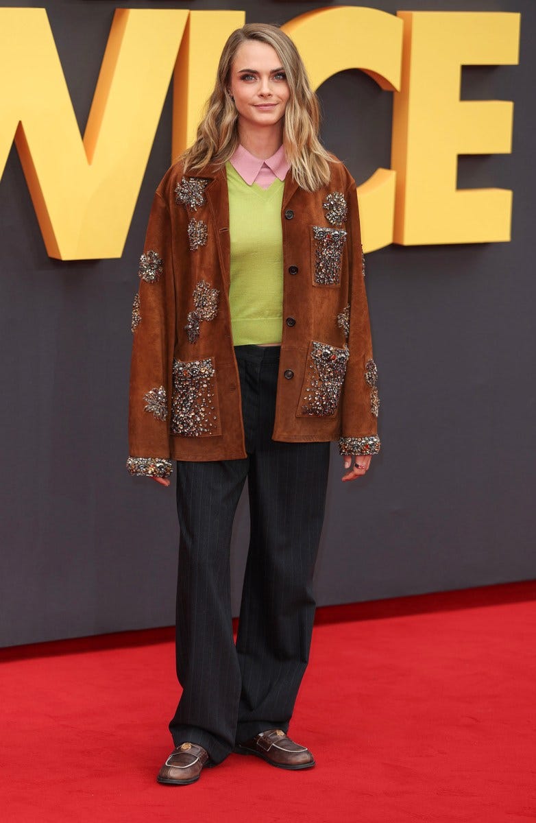
- The public opinion on this look has not been positive, but I’m obsessed. Last week, @oldlooserinbrooklyn made a TikTok talking about how Miu Miu’s full look policy ruined their Spring 2024 collection, as did the way Sydney Sweeney wore a full Chloé look recently, and I so very much agree! That’s why I love this so much! It’s not styled the same way it was on the runway which makes it more believable, and it just feels a lot more like Cara. I also think it proves that you don’t have to wear a full look for it to translate as being a certain brand or designer’s work/brand image.
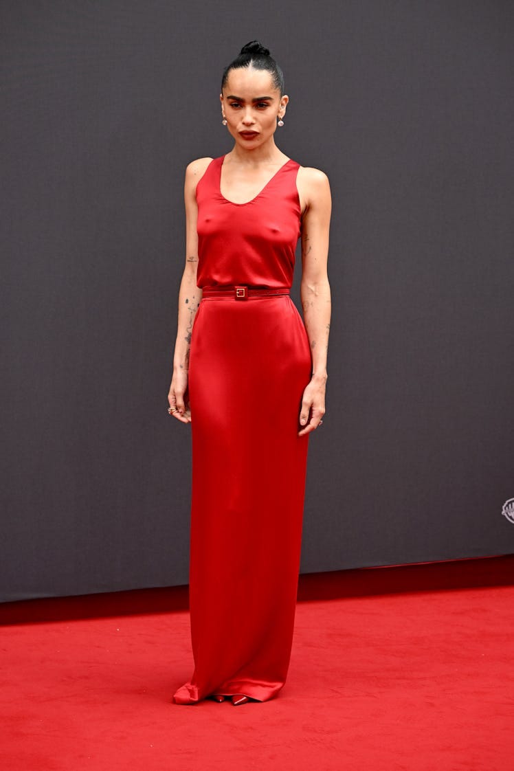
- This is very Anthony Vaccarello for Saint Laurent and it’s fine, but the belt not lining up with the waist seam and it being too long just ruins it. Something so simple should at least pay attention to detail.
- Let’s talk about the tan suit. Or should I say the COCONUT brown suit. I very vividly remember when Kamala was on the cover of Vogue after becoming Vice President and people were underwhelmed, to say the least, about the styling and creative direction. It was said to be far too casual and people did not love her Converse, even though she’s the one who wanted to wear them. We’ve never cared about what vice presidents have worn in the past, really, and so this unremarkable styling of Kamala during her time as VP didn’t feel like anything out of the ordinary in terms of the grand scheme of vice presidents, because well, they’ve all been men. So, really, did we only care about what she wore because she was a woman? Of course, there’s been dresses here and there by designers like Sergio Hudson, but mainly it’s been the same style of pantsuit over and over again, perhaps not to draw so much attention, and being very aware of where she stands and who she is and what people are looking at. Lately, we’ve seen her wear Celine and Chloé— two luxury French brands. Not very relatable or American, but very cool and strong. The tan suit is interesting here, because traditionally, darker suits like black, navy, and gray are associated with formality and authority in a political context. Whereas the tan is a little bit softer and more approachable, yet it is still a beautifully tailored suit by a luxury brand whose creative director is a woman. So although it carries a neutrality, it breaks from that rigidness that we see in traditional power dressing. Perhaps it is to appeal to a broader audience, while still not being entirely distracting, to show that commitment to standing in her power and proving she is the one for the job. Chloé as a brand itself has always been associated with femininity, freedom, and a modern woman, so she’s aligning herself with these values— being forward thinking and having an inclusive approach to her leadership position. It challenges traditional norms, as she does being a Black, South Asian woman running for president, while still respecting the political role she is taking on. So yes, not wearing an American designer was an interesting choice, but I also think the choice of this suit was very strategic, and I’m sure this is not the last think piece provoking thing we’ll see when it comes to her styling.
- Michelle Obama wore a beautifully deconstructed Monse suit jacket with matching pants. She continues to be a fashion girl, but there’s also something about this jacket that feels like armor.
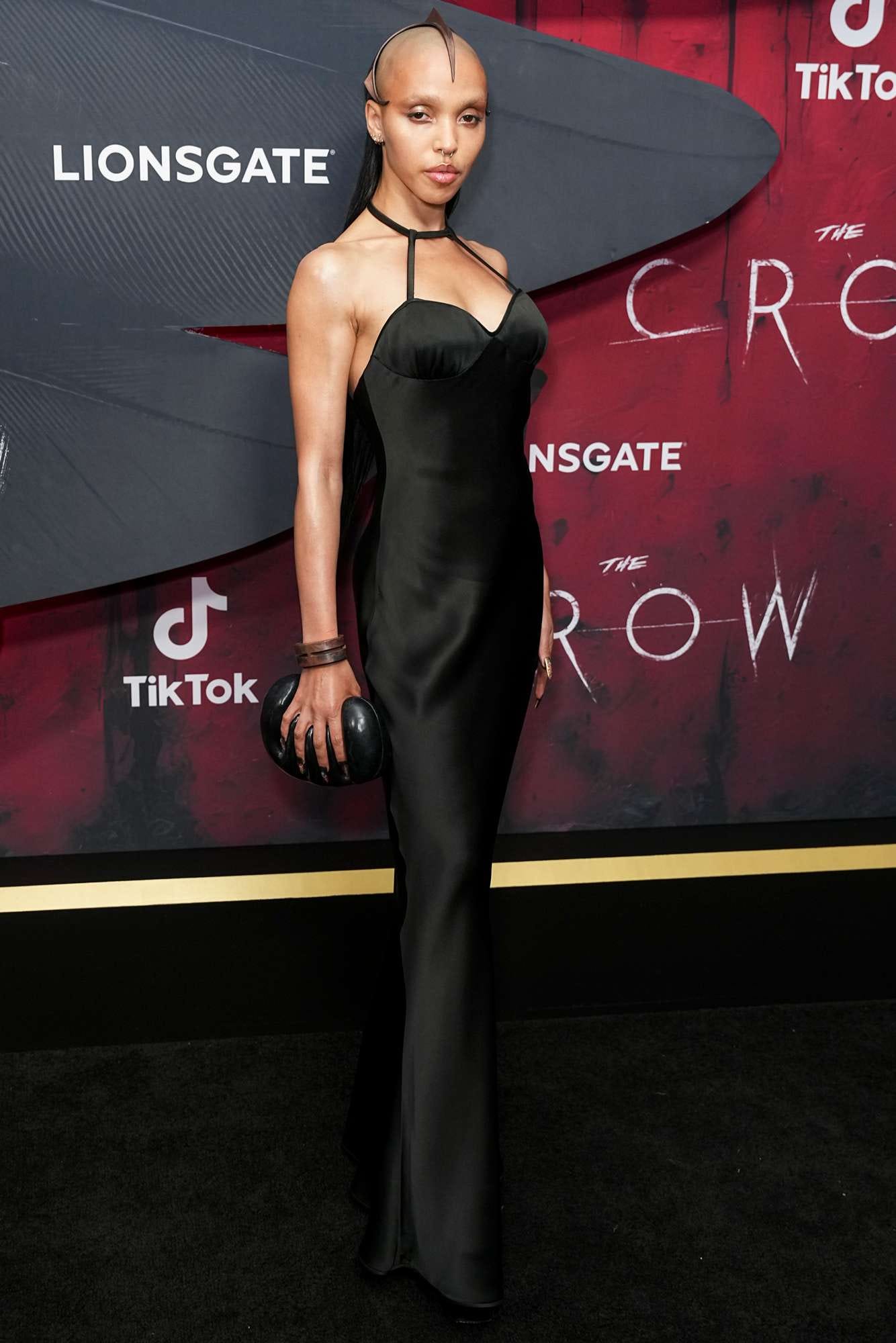
- Just everything about FKA Twigs on this press tour for The Crow has been perfection. Argue amongst yourselves.
- Ella Emhoff wore a dress by TikToker Joe Ando which is very cool and the dress is also very cute!
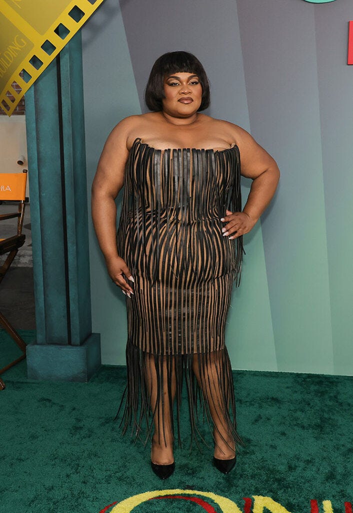
- We all know Da’Vine is a fashion girl and I love that she always goes for it, as she did here, but this dress already wasn’t very good on the runway. I also think that if these leather strips had stopped at the underskirt it would have been more effective at this nude illusion it’s trying to have.
- Usher in Robert Wun Spring 2024 Couture. INSANE.
- Dua Lipa wearing Dilara Findikoglu on her birthday on an island makes sense. All is calm. All is bright.
So that was this week! I just started watching A Discovery of Witches and this vampire man already has me giggling and kicking my feet so I g2g.
TTYL!!!
xx


